Neutral Grey
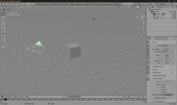
A neutral grey theme for Blender.
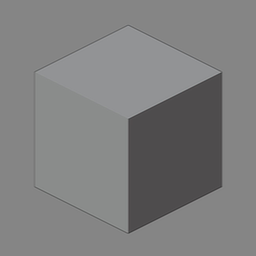
This theme provides a neutral theme grey for Blender. This option is useful because of optical phenomena such as the checker shadow illusion. By relying mostly on midgrey for every aspect of the interface, it tries to minimize the contrast between the viewport content and the surrounding interface.
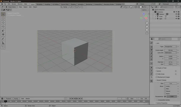
Tip: when checking your render with this theme, enable the passepartout in the camera options and set its opacity to 1.0 to reduce the influence of the surrounding context.
The theme is originally based on Neutral - Theme for Blender 2.8 by TheRedWaxPolice.
What's New
1.2.3 October 14th, 2024
- 4.3 fixes
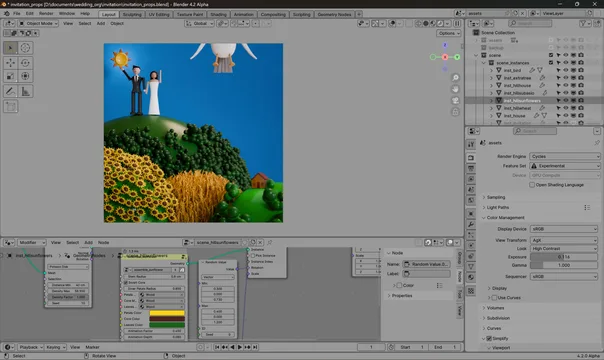
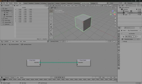
I made some colored elements less saturated and add a little bit contrast, to outliner's items for example, otherwise it's perfect, no color pollution around your work, clean content focused setup