 Piano_White
Elegant piano-inspired light theme by kame404.
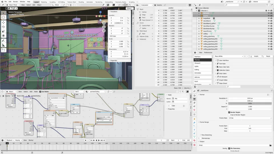
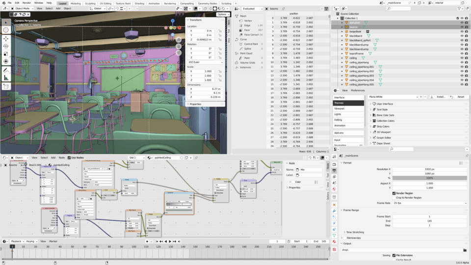
Featured image
Modern themes for Blender
What's New
0.0.3 September 2nd, 2024
Improved tooltips readability by removing text shadow.
Activity
-
-
- nickberckley changed review status to Approved
- 1 mo
Approved
-
Hi! Just a heads up that in Blender 4.3 there is a new Text Style property for tooltips that you might want to adjust, because by default it adds a dark shadow (to match the default theme) but in themes like this where the text is also dark, it makes it look a bit fuzzy. Cheers!
-
-
Thanks for the heads up about the new Text Style property and the shadow issue! You were spot on, it was causing readability problems with lighter themes. I've removed the shadow in the latest update, so the tooltips should be much crisper now. I appreciate your attention to detail and your contribution to improving the user experience.
Add comment
Sign in to comment.
Ready for review